Having bloged on my own for a while, I am now starting an experiment of using the Web 2.0 tools to create a Collaborative Learning Environment. I will admit, this is not new and I have found many examples of such environments, many of which I will be talking about in posts to follow. I am hoping that a collaborative learning environment will combine the best of many personal learning environments in the team.
Our experiment of constructivism learning started with a small group of 7 instructional designers and 1 project manager in the physical world, i.e. a meeting room in our office. The intent of taking this online is to include many more in our learning experience. The idea is to Engage people by Encouraging them to Explore new Environments and Experiment with the them. We settled on 3 Es to finalize on this eCube community.
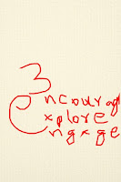
As we experiment with our logo, here are the initial ideas. Let's see how the logo finally turns out.
I expect the 1% rule will probably be applicable in this blog too but I am hoping that since the audience for this one is more targetted and defined, perhaps we will have more than 1% contributors and 10% commenters.
Sunday, February 10, 2008
Subscribe to:
Post Comments (Atom)


5 comments:
Hi,
ecube logo options look very intersting. For me it turned out to be puzzle, as all the verbs used start and end with letter 'E'.
We can use letter E as { } with the cube to whole and keep- courg,xplor,and ngage in side the { }.
It just directly maps with the title- ecube...
Just an idea!!!!
I liked the second option. A couple of ideas:
A) We could show a cube (geometrical shape) with the words Encourage, Explore, and Engage written on its 3 visible faces.
B) Instead of writing the letter E as writtin in option 2, we could write it as '<-'with the three words forming the three branches of the arrow shaped E. This could also be infered as convergence and moving in a definite drection.
I didn't quite get why you need a 'logo', unless it is an exercise in creative collaboration. Anyway, collaboration is about people connecting with people. So I would want a right brained/visual aspect in this. A person in front of another. This brings to mind the notion of the carot sign (^), which represents "to the power of" in Excel. So I would suggest something like "E^3". Here, E^3 could look like a mirror image, if either E or 3 is stylized - providing symmetry, which work in logos. Also, both stylized images could resemble people. Basically a person talking to another across a table (in this case the carot sign)! That's my 2 bits. If it doesn't make any sense, trash it! :-)
Interesting thoughts about the logo - I am more into people - so after reading these three words – Engage, Encourage, Explore - all I see is people!
My vision is of three or more human silhouettes (engage) standing, holding hands (encourage); facing outwards (not each other). The silhouettes on the extreme left and extreme right have their one arm extended upwards (explore).
Too simple or common?
.....Isn't that the point! :-)
Finally, we have an attractive and meaningful logo. Great!!!
Post a Comment